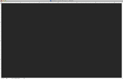
Friday 26 December 2008

Different Text with Topic below!

Repeat from step 1 to 3, and then right click on layer text and select Bevel and Emboss and set the table like that:

Finally, reduce fill of layer text to 0% and see the effect:

Monday 22 December 2008

Text with Photoshop!

Step 1: Using gradient tool and fill color for the background, any color you want. With me:


Step 2: Command + J to duplicate background layer and you will have a new layer - layer 1. After that go to Image -> Adjustment -> Brightest/Contrast and type 30 for Brightest and you get:

Step 3: Use Type tool(T) and type mr.lacastuwet with any font:

Step 4: Choose layer 1 and Command+click to T square and press Delete. After that right click to layer 1 and choose Blending Options and select Drop Shadow. Finally, see the effect that you had created:

Sunday 21 December 2008

Easy but impressive......

Open Illustrator and create a new file with any size you want.

Step 1:

Using Pen Tool (P) to draw a curve, after that duplicate this curve and combine them in a group like:

Step 2:

Go to Object -> Blend -> Blend Options and choose 20 for Specified Steps. You will get this:


Step 3: Duplicated layer in step 2 and arrange them by different angel and you have:

Step 4: Fill color and this is my work

My Book Cover Design!

There is my book cover design. I had done two version.

Version 1:

Version 2:

I think my book cover is too dazzling because background color is red. After I do it, I think I should use yellow color for more contrast.

However, my bookmark may be a Magaret Smead card to fix with the book cover and more related to each other.

Sunday 7 December 2008

Cool Background in Photoshop!

Step 1:

Create a new document, with me I choosed 1920pixels x 1200pixels and then filled it with dark color; not black color because it will not effect, and you will got it.
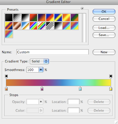
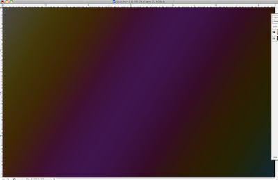
Step 2:

Create a new layer and fill with gradient tool and my gradient setting as follow: blend mode is Overlay, style is linear and angle is 45. You can select a default gradient color in photoshop or create a new one.
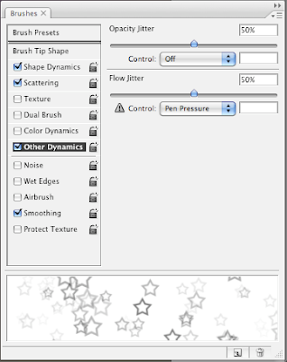
Step 3:

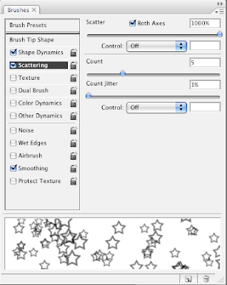
Choosing brush tool and go to brushes palette (fn+F5) and pick up Following Star. The spacing is very important and change the value is 100. Next, select Shape Dynamics, then Scattering and last one is Other Dynamics for the value use images below:


Step 4:

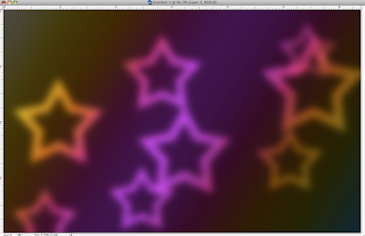
Create a new layer and change Blend mode to Color Dodge, then pick up brush tool and set the color is white and paint some stars. For that time, use big size, like 600-800 pixels. After that, Go to Filter>Blur>Gaussian Blur. For this first layer use 20 pixels for the Radius.

Step 5:

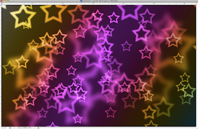
Create a new layer and do the same things with step 4, but now, use a smaller size and go to Filter>Blur>Gaussian Blur. For this first layer use 4 pixels for the Radius.

Step 6:

Do the same things with step 4 and 5 and
for this first layer use 1 pixels for the Radius. There is my work and another.


My photomontage!

There is my photomontage for assignment 2A. I used 8 elements to create it. My topic is loneliness to describe a lonely girl after she broke up her boy friend.

I had added some happy couples in my image to compare with her situation at that moment; lonely, empty and so on. This is my work.

Sunday 30 November 2008

Typography!

There is my home work, and topic is typography. I draw them and scan them. My idea comes from leafs and branches. Finally, I have my typography.

My Layout for my Reasearch Page!

This is my first assignment, I have to choose one designer and write some things about his/her biography, style and so on. Moreover, I also pick up three work of them to critic, it should follow assignment brief in four concepts including Elements, Gestalt, Principles and Typography. After that, I have to layout it like a magazine.

My designer is April Greiman, she was born in 1948 in New York City. She is an American graphic designer innovative work reflects a witty synthesis of Swiss style graphic design, the colors and the multilayered effects made whose highly possible technology. During her life, April Greiman got lost of awards and published many books. She also established her Inc called "Made In Space"!

Finally, there is my work. I think my background is not good.

Sunday 16 November 2008

Animated buttons with Flash.

In this topic, I do not know "How to post file .swf on www.blogger.com?", so I will post images.

Blending and Layer Style

I mostly use blending options and layer style and some brush presets to create this image. The picture is about rainbows at night, but i think this image is in trouble with colors and the size should be smaller.

I create rainbows in Illustrator by using Appearance panel after I draw a circle by Ellipse Tool to add more strokes.

Sunday 9 November 2008

My Gestalt Exercise.

Gestalt theory is a new knowledge with me and there are five gestalt concepts including closure, continuance, similarity, proximity and alignment. I think it is quite difficult because you will be confused about five concepts, they have little bit similarity and you will have mistake if you do not understand them clearly.

This is a exercise to apply for gestalt and my work.

Creating texts with Photoshop.

There is a easy way to creating texts with Photoshop, it does not cost lots of time to do.

And this is my work.

Sunday 2 November 2008

My T-shirt Design...!

There is my T-shirt design and the topic is Sun & Moon, 4 colour is maxium including no words. My idea comes from tattoo style and try to make sun and moon in symbols. I think it is a interesting topic but very difficult because you have to design that when people look at your T-shirt and understand what are you going to show .

Firstly, I try to draw sun and moon but after that, I can not draw them in Illustrator again, so I change to make them simple and easy for everyone is easy to understand.

I think my sun and moon is easiest, just moon and sun combine together, but the moon is a little bit difficult to see. Then, arounding them is some symbol like tattoo and I keep my desgin in back and white colour. Finally I got my T-shirt design.
Thanks!

Sunday 7 September 2008

Come back to POSTER DESIGN! A Guide to Designing a POSTER

Some good things that i had discovered about Poster Design "How to have a good poster design!"

Designing a poster is a challenge because space is limited. It must be lean and clean, standing alone if you are not present, and gain attention as audience come and go.

1. General Information about Poster Sessions
2. Analyzing Your Audiences
3.
Showcasing the "News" in your Topic
4. Visualizing the "News" in the Design Space
5. Creating Coherence
6. Applying Poster Style to the Text of Your Poster

To get more information and have a good understanding about designing poster design:

VISIT: http://www.owlnet.rice.edu/~cainproj/designing.html


Usefull websites..........!

There are some useful websites that i often use them during DIM2.

1.gotoandlearn.com - This website is all tutorials about FLASH by a famous man. Visit his blog for more advanced tutorial.

2.zensoft.vn - PHOTOSHOP and FLASH tutorialls.

3.illustratorworld.com - A good website for people who like ILLUSTRATOR, we can share our works, study and more.

I expected them will be useful for everyone who come to my blog.

Saturday 6 September 2008

Amazing Animal...for Fun...! - Part2

There are some more funny images, Have Fun with them!


Enjoy!^^...

Sunday 24 August 2008

Amazing Animal...for Fun...! - Part1

Let look at some animals after using Photoshop to combine them together!


Animals also are stylists:


To be Continued.......